
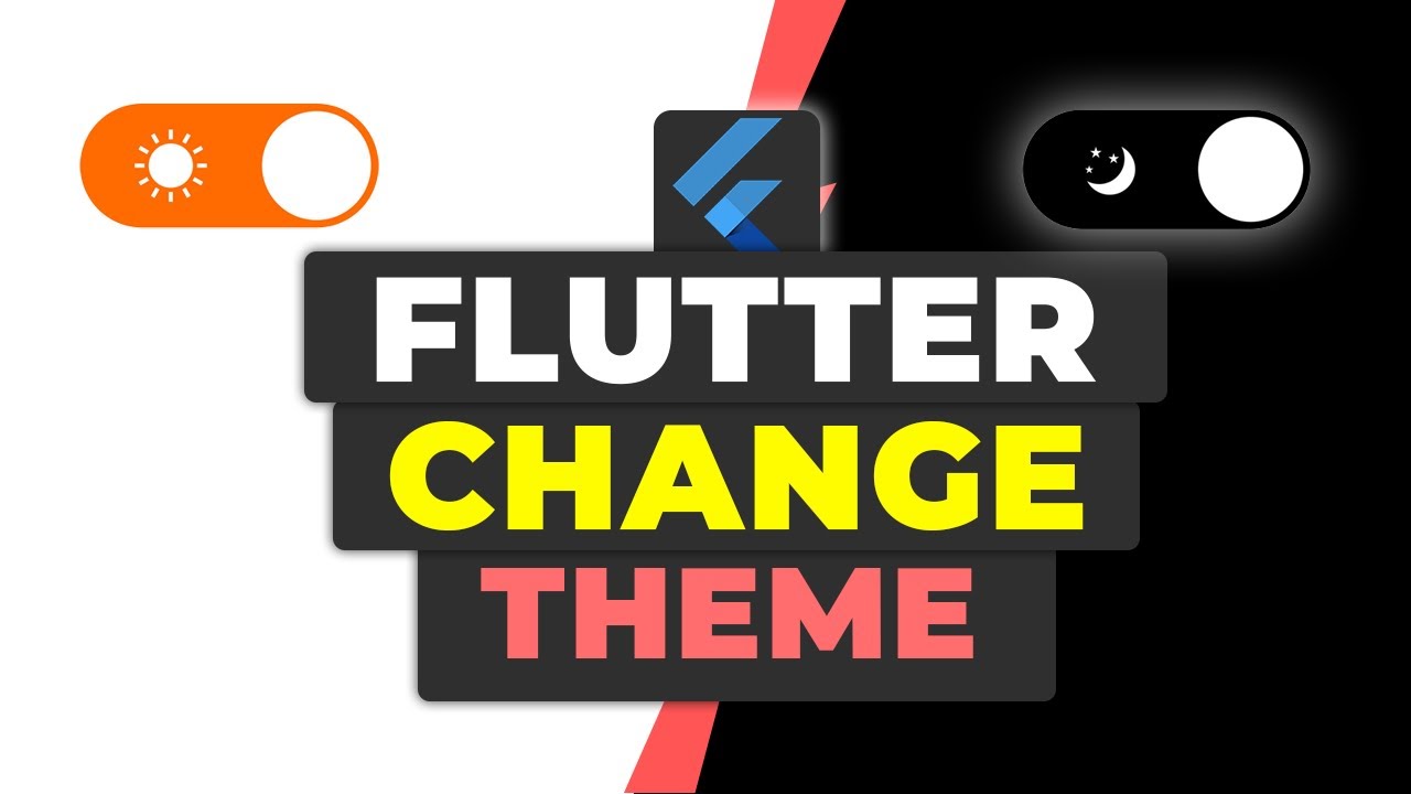
In this tutorial, we’ll cover how to switch themes in a Flutter application using the Provider package. This will allow users to toggle between light and dark themes seamlessly.
If you prefer watching a video tutorial here is a link to that.
Introduction
Changing themes dynamically in a Flutter application can enhance user experience significantly. By the end of this guide, you’ll be able to switch between light and dark themes in your Flutter app with a simple button press.
Step 1: Setting Up Your Flutter Project
First, create a new Flutter project and add the necessary dependencies.
Dependencies:
Add the following dependencies to your pubspec.yaml file:
provider:
– A popular package for dependency injection and state management in Flutter applications. To get the dependency click here.
json_theme:
– A package for parsing and applying JSON-based themes in your Flutter project. To get the dependency click here.
dependencies:
  flutter:
    sdk: flutter
  provider: ^5.0.0
  json_theme: ^1.0.0
Run flutter pub get in your terminal to install the dependency.
flutter pub getStep 2: Creating the Theme Provider
The ThemeProvider will manage the theme state and load the theme data from JSON files.
2.1: Theme Provider Enum and Class Initialization
Create a new file named theme_provider.dart and add the following code:
import 'dart:convert';
import 'package:flutter/material.dart';
import 'package:flutter/services.dart';
import 'package:json_theme/json_theme.dart';

enum ThemeEnum { Dark, Light }

class ThemeProvider extends ChangeNotifier {
  ThemeEnum currentTheme = ThemeEnum.Light;
  ThemeData? currentThemeData;

  static ThemeProvider? _instance;
  static ThemeProvider get instance {
    _instance ??= ThemeProvider._init();
    return _instance!;
  }

  ThemeProvider._init();
}
2.2: Changing and Generating Theme Data
Continue to add the theme changing and data generation methods:
class ThemeProvider extends ChangeNotifier {
  // existing code...

  Future<void> changeTheme(ThemeEnum theme) async {
    currentTheme = theme;
    await _generateThemeData();
    notifyListeners();
  }

  Future<void> _generateThemeData() async {
    String themeStr = await rootBundle.loadString(_getThemeJsonPath());
    Map themeJson = jsonDecode(themeStr);
    currentThemeData = ThemeDecoder.decodeThemeData(themeJson);
  }

  String _getThemeJsonPath() {
    switch (currentTheme) {
      case ThemeEnum.Light:
        return "assets/themes/theme_light.json";
      case ThemeEnum.Dark:
        return "assets/themes/theme_dark.json";
      default:
        return "assets/themes/theme_light.json";
    }
  }
}
Step 3: Initializing the Theme Provider
Update your main.dart to initialize the theme provider and set up the theme management.
3.1: Main Function
The main function initializes the app and sets the default theme.
import 'package:flutter/material.dart';
import 'package:flutter_theme_management_tutorial/providers/theme_provider.dart';
import 'package:provider/provider.dart';

void main() async {
  WidgetsFlutterBinding.ensureInitialized();
  await ThemeProvider.instance.changeTheme(ThemeEnum.Light);
  runApp(const MyApp());
}
3.2: MyApp Widget
The MyApp widget sets up the MultiProvider and the MaterialApp.
class MyApp extends StatelessWidget {
  const MyApp({super.key});

  @override
  Widget build(BuildContext context) {
    return MultiProvider(
      providers: [
        ChangeNotifierProvider(
          create: (_) => ThemeProvider.instance,
        ),
      ],
      builder: (context, widget) {
        return MaterialApp(
          title: 'Flutter Demo',
          theme: Provider.of<ThemeProvider>(context).currentThemeData,
          home: const MyHomePage(title: 'Flutter Demo Home Page'),
        );
      },
    );
  }
}
Step 4: Creating the Home Page
In main.dart, define the home page which includes a button to toggle the theme.
4.1: Home Page State and Increment Counter
Define the stateful widget for the home page and the counter increment logic.
class MyHomePage extends StatefulWidget {
  const MyHomePage({super.key, required this.title});

  final String title;

  @override
  State<MyHomePage> createState() => _MyHomePageState();
}

class _MyHomePageState extends State<MyHomePage> {
  int _counter = 0;

  void _incrementCounter() {
    setState(() {
      _counter++;
    });
  }
4.2: Building the Home Page Widget
Build the UI for the home page, including the theme toggle button and counter display.
  @override
  Widget build(BuildContext context) {
    ThemeProvider _themeProvider = Provider.of<ThemeProvider>(context);
    return Scaffold(
      appBar: AppBar(
        backgroundColor: Theme.of(context).colorScheme.inversePrimary,
        title: Text(widget.title),
        // theme toggle icons (code given below)
      ),
      body: Center(
        child: Column(
          mainAxisAlignment: MainAxisAlignment.center,
          children: <Widget>[
            const Text(
              'You have pushed the button this many times:',
            ),
            Text(
              '$_counter',
              style: Theme.of(context).textTheme.headlineMedium,
            ),
          ],
        ),
      ),
      // floating action button (code given below)
    );
  }
}
4.3: Increment Button
The increment button increases the counter each time it’s pressed.
floatingActionButton: FloatingActionButton(
  onPressed: _incrementCounter,
  tooltip: 'Increment',
  child: const Icon(Icons.add),
),
4.4: Theme Toggle Icons
actions: [
  IconButton(
    onPressed: () {
      if (_themeProvider.currentTheme == ThemeEnum.Light) {
        _themeProvider.changeTheme(ThemeEnum.Dark);
      } else {
        _themeProvider.changeTheme(ThemeEnum.Light);
      }
    },
    icon: Icon(
      _themeProvider.currentTheme == ThemeEnum.Light
          ? Icons.light_mode
          : Icons.dark_mode,
    ),
  )
],
Step 5: Creating the Theme JSON Files
Create a new directory in assets/themes and add two JSON files, theme_light.json and theme_dark.json. You can get the theme JSON files from the appainter.dev.
Update your pubspec.yaml to include these assets:
flutter:
  assets:
    - assets/themes/theme_light.json
    - assets/themes/theme_dark.json
Get Source Code for free:
Conclusion
By following this guide, you have implemented a theme switcher in your Flutter app using the Provider package. Users can now switch between light and dark themes easily. Feel free to customize the theme JSON files and further improve the user interface.
Happy coding!


Leave a Reply