
Onboarding is a critical component of any successful mobile application. It sets the tone for the user’s entire experience and can make or break their first impression. In this blog post, we’ll explore how to create a stunning onboarding flow for your Flutter app, ensuring a seamless and captivating introduction for your users.
If you prefer watching a video tutorial here is a link to that.
Laying the Foundation
To get started, we’ll need to set up the necessary dependencies and assets for our project. The only dependency we’ll be using is the smooth_page_indicator package, which will help us create a smooth and visually appealing page indicator at the bottom of our onboarding screens. In the pubsec.yaml file add the following in the dependencies section.
dependencies:
  flutter:
    sdk: flutter
  smooth_page_indicator: ^1.1.0
To download the dependency click here.
Next, we’ll add the required image assets to our project. In this case, we’ll have three images, one for each of the onboarding screens. Save the given images in ./assets/images.


Add the following inside the pubsec.yaml file.
  assets:
    - assets/images/
Designing the Onboarding UI
Our onboarding flow will consist of two main components: the content that changes on each screen (the image, title, description, and button) and the page indicator at the bottom, which will help users understand their progress through the onboarding process.
To achieve this, we’ll divide our user interface into two parts: the content area and the page indicator. The content area will be managed using a PageView widget, which will allow users to swipe between the different onboarding screens. The page indicator will be implemented using the SmoothPageIndicator widget from the smooth_page_indicator package.
@override
Widget build(BuildContext context) {
  return Scaffold(
    body: Padding(
      padding: const EdgeInsets.symmetric(
        vertical: 50.0,
      ),
      child: Column(
        mainAxisSize: MainAxisSize.max,
        mainAxisAlignment: MainAxisAlignment.center,
        crossAxisAlignment: CrossAxisAlignment.center,
        children: [
          Expanded(
            child: PageView(
              controller: _pageController,
              children: _onBoardingPages,
            ),
          ),
        );
      ),
  }
Creating a Reusable Onboarding Card
To ensure that our onboarding screens are easily customizable and maintainable, we’ll create a reusable OnboardingCard widget. This widget will encapsulate the content for each onboarding screen, including the image, title, description, and button.
class OnboardingCard extends StatelessWidget {
  final String image, title, description, buttonText;
  final Function onPressed;

  const OnboardingCard({
    super.key,
    required this.image,
    required this.title,
    required this.description,
    required this.buttonText,
    required this.onPressed,
  });
By making the OnboardingCard widget reusable, we can easily add, remove, or modify the content of each onboarding screen without having to change the core logic of our onboarding flow.
@override
Widget build(BuildContext context) {
  return Container(
    height: MediaQuery.sizeOf(context).height * 0.80,
    width: MediaQuery.sizeOf(context).width,
    child: Column(
      mainAxisSize: MainAxisSize.max,
      mainAxisAlignment: MainAxisAlignment.spaceEvenly,
      crossAxisAlignment: CrossAxisAlignment.center,
      children: [
        Padding(
          padding: const EdgeInsets.all(
            50.0,
          ),
          child: Image.asset(
            image,
            fit: BoxFit.contain,
          ),
        ),
        Column(
          children: [
            Text(
              title,
              textAlign: TextAlign.center,
              style: TextStyle(
                color: Theme.of(context).colorScheme.primary,
                fontSize: 25,
                fontWeight: FontWeight.bold,
              ),
            ),
            Padding(
              padding: const EdgeInsets.all(
                10.0,
              ),
              child: Text(
                description,
                textAlign: TextAlign.center,
                style: TextStyle(
                  color: Theme.of(context).colorScheme.secondary,
                  fontSize: 15,
                  fontWeight: FontWeight.w300,
                ),
              ),
            )
          ],
        ),
        MaterialButton(
          minWidth: 300,
          onPressed: () => onPressed(),
          color: Theme.of(context).colorScheme.primary,
          child: Text(
            buttonText,
            style: const TextStyle(
              color: Colors.white,
            ),
          ),
        )
      ],
    ),
  );
}
Creating a OnboardingPages List
We will now create a OnboardingPages list of pages containing attributes like image, title, button text etc.
Additionally, we’ll implement the functionality for the “Next” and “Done” buttons, allowing users to navigate between the onboarding screens using both swipe gestures and button clicks
List<Widget> _onBoardingPages = [
OnboardingCard(
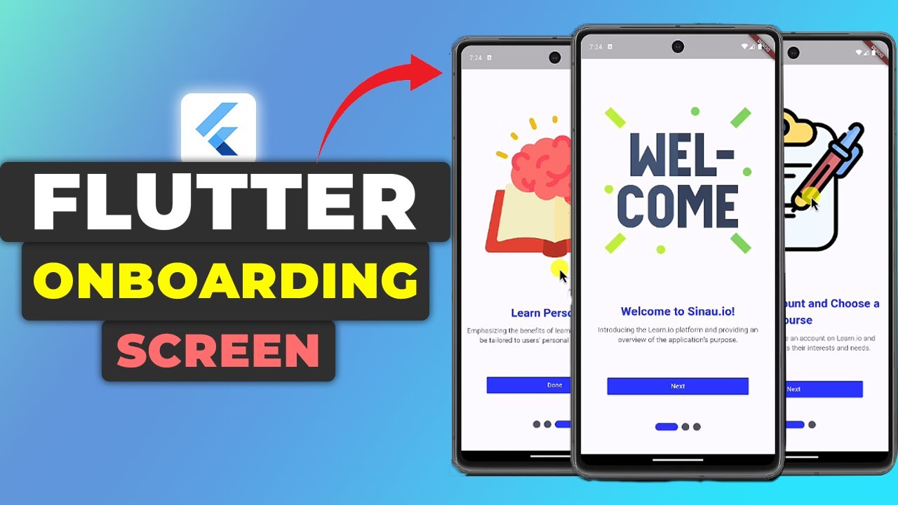
image: "assets/images/onboarding_1.png",
title: 'Welcome to Sinau.io!',
description:
'Introducing the Learn.io platform and providing an overview of the application\'s purpose.',
buttonText: 'Next',
onPressed: () {
_pageController.animateToPage(
1,
duration: Durations.long1,
curve: Curves.linear,
);
},
),
OnboardingCard(
image: "assets/images/onboarding_2.png",
title: 'Create an Account and Choose a Course',
description:
'Directing users to create an account on Learn.io and select a course that fits their interests and needs.',
buttonText: 'Next',
onPressed: () {
_pageController.animateToPage(
2,
duration: Durations.long1,
curve: Curves.linear,
);
},
),
OnboardingCard(
image: "assets/images/onboarding_3.png",
title: 'Learn Personally',
description:
'Emphasizing the benefits of learning on Learn.io that can be tailored to users\' personal needs and abilities.',
buttonText: 'Done',
onPressed: () {},
),
];
Implementing the Onboarding Flow
With the reusable OnboardingCard widget in place, we can now create the actual onboarding flow in our OnboardingPage widget. This widget will be responsible for managing the PageView and the SmoothPageIndicator, as well as handling the navigation between the different onboarding screens.
class _OnboardingPageState extends State<OnboardingPage> {
  static final PageController _pageController = PageController(initialPage: 0);

  //list of pages here

  @override
  Widget build(BuildContext context) {
    return Scaffold(
      body: Padding(
        padding: const EdgeInsets.symmetric(
          vertical: 50.0,
        ),
        child: Column(
          mainAxisSize: MainAxisSize.max,
          mainAxisAlignment: MainAxisAlignment.center,
          crossAxisAlignment: CrossAxisAlignment.center,
          children: [
            Expanded(
              child: PageView(
                controller: _pageController,
                children: _onBoardingPages,
              ),
            ),
            SmoothPageIndicator(
              controller: _pageController,
              count: _onBoardingPages.length,
              effect: ExpandingDotsEffect(
                activeDotColor: Theme.of(context).colorScheme.primary,
                dotColor: Theme.of(context).colorScheme.secondary,
              ),
              onDotClicked: (index) {
                _pageController.animateToPage(
                  index,
                  duration: Durations.long1,
                  curve: Curves.linear,
                );
              },
            ),
          ],
        ),
      ),
    );
  }
}
We’ll link the PageView and the SmoothPageIndicator by using the same PageController instance, ensuring that the page indicator accurately reflects the user’s progress through the onboarding flow..
Customizing the Onboarding Experience
To make the onboarding experience more engaging and visually appealing, we’ll customize the styling of the various UI elements. This includes setting the colors for the page indicator, adjusting the animation effects, and ensuring that the overall design aligns with the branding and aesthetics of your application.
By leveraging the customization options provided by the SmoothPageIndicator widget, you can create a unique and memorable onboarding experience for your users.
Get Source Source for free:
Conclusion
Creating a stunning onboarding flow for your Flutter app is a crucial step in providing a seamless and engaging user experience. By following the steps outlined in this blog post, you can build a visually appealing and functional onboarding flow that sets the stage for your users’ journey within your application.
Remember, a well-designed onboarding experience can make a lasting impression and significantly improve user retention and satisfaction. So, take the time to craft an onboarding flow in flutter that truly showcases the best of your app and leaves a lasting impact on your users.
Happy Coding…!


Leave a Reply