
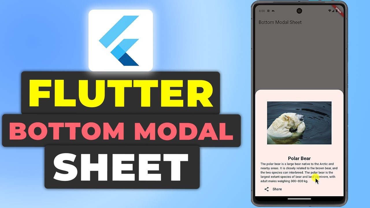
In this guide, we’ll walk through how to implement a bottom modal sheet in a Flutter application. By the end, you’ll have a fully functional app that displays a modal bottom sheet with an image, text, and a share button.
Setting Up the Project
Creating a New Flutter Project
First, create a new Flutter project. If Flutter is already installed, use the following command to create a new flutter project:
flutter create modal_sheetRun the following command to change to the projects directory:
cd modal_sheetProject Structure
Here is the structure of the project:
lib/
|-- main.dart
|-- pages/
    |-- home_page.dart
Writing the Main Application Code
Let’s start by setting up the main application.
main.dart
In main.dart, we initialize the app and set up the MaterialApp:
import 'package:flutter/material.dart';
import '../pages/home_page.dart';

void main() {
  runApp(const MyApp());
}

class MyApp extends StatelessWidget {
  const MyApp({super.key});

  @override
  Widget build(BuildContext context) {
    return MaterialApp(
      title: 'Flutter Demo',
      theme: ThemeData(
        colorScheme: ColorScheme.fromSeed(seedColor: Colors.deepPurple),
        useMaterial3: true,
      ),
      home: HomePage(),
    );
  }
}- main.dart: This file contains the main function which is the entry point of the Flutter application. It runs the MyApp widget.
- MyApp Widget: This is a stateless widget that sets up the
MaterialAppwith a title, theme, and home page.
Building the Home Page
The HomePage will contain a floating action button (FAB) that, when pressed, will display the modal bottom sheet.
Creating home_page.dart
Create a new Dart file named home_page.dart in the lib/pages directory:
import 'package:flutter/material.dart';

class HomePage extends StatefulWidget {
  const HomePage({super.key});

  @override
  State<HomePage> createState() => _HomePageState();
}- HomePage Widget: This is a stateful widget that will hold the state of our home page.
Building the Scaffold
Next, we need to build the scaffold which includes the app bar and floating action button.
class _HomePageState extends State<HomePage> {
  @override
  Widget build(BuildContext context) {
    return Scaffold(
      appBar: AppBar(
        title: const Text(
          "Bottom Modal Sheet",
        ),
      ),
      floatingActionButton: FloatingActionButton(
        onPressed: () {
          _showBottomModalSheet(context);
        },
        child: const Icon(
          Icons.open_in_browser,
        ),
      ),
    );
  }
}- Scaffold: Provides a structure for the visual interface, including the app bar and FAB.
- AppBar: The app bar displays the title of the app.
- FloatingActionButton: The FAB triggers the display of the modal bottom sheet when pressed.
Showing the Modal Bottom Sheet
Add the function to show the modal bottom sheet:
void _showBottomModalSheet(BuildContext context) {
  showModalBottomSheet(
    context: context,
    builder: (context) {
      return Padding(
        padding: const EdgeInsets.symmetric(
          vertical: 5.0,
          horizontal: 25.0,
        ),
        child: Column(
          mainAxisSize: MainAxisSize.min,
          children: [
            _buildModalContent(),
          ],
        ),
      );
    },
  );
}- _showBottomModalSheet: This method shows the modal bottom sheet using
showModalBottomSheet. - Padding and Column: Adds padding around the content and organizes the content in a column.
Building the Modal Content
Add the function to build the modal content:
Widget _buildModalContent() {
  return Column(
    children: [
      Container(
        height: 300,
        width: 300,
        decoration: const BoxDecoration(
          image: DecorationImage(
            image: NetworkImage(
              "https://images.pexels.com/photos/26600774/pexels-photo-26600774/free-photo-of-a-polar-bear-is-swimming-in-the-water.jpeg?auto=compress&cs=tinysrgb&w=1260&h=750&dpr=1"
            ),
          ),
        ),
      ),
      const Text(
        "Polar Bear",
        style: TextStyle(
          fontWeight: FontWeight.bold,
          fontSize: 22,
        ),
      ),
      const Text(
        "The polar bear is a large bear native to the Arctic and nearby areas. It is closely related to the brown bear, and the two species can interbreed. The polar bear is the largest extant species of bear and land carnivore, with adult males weighing 300–800 kg.",
      ),
      ListTile(
        leading: const Icon(
          Icons.share,
        ),
        title: const Text(
          "Share",
        ),
        onTap: () {
          Navigator.pop(context);
        },
      ),
    ],
  );
}- _buildModalContent: This method builds the content for the modal.
- Container: Displays an image of a polar bear.
- Text Widgets: Display the title and description of the polar bear.
- ListTile: Provides a share button that closes the modal when tapped.
Get Source Code for free:
Conclusion
In this tutorial, we demonstrated how to implement a bottom modal sheet in a Flutter application. By following these steps, you can create a modal that enhances user interaction with your app.
Happy coding!


Leave a Reply