
In this tutorial, we’ll dive into building a dynamic GridView in Flutter, which is perfect for displaying images or any collection of items in a grid format. Using Flutter’s GridView.builder, we’ll ensure efficient rendering even with a large dataset.
Introduction to GridView in Flutter
The GridView widget in Flutter allows developers to create a scrollable grid of items. It’s highly customizable, providing flexibility in terms of layout and behavior. In this guide, we’ll set up a simple grid that displays images fetched from the internet. This project is a great way to get started with Flutter’s powerful UI capabilities and to learn about dynamic layouts.
Setting Up Your Flutter Project
To begin, create a new Flutter project in your preferred IDE. Ensure that you have Flutter and Dart installed on your system. For this project, we will use the default Flutter libraries, so no additional dependencies are required.
Main Entry Point
The main entry point of our Flutter application will define the overall structure and theme. Here, we set up a MaterialApp with a custom color scheme and specify the HomePage as the initial route.
import 'package:flutter/material.dart';
import '../pages/home_page.dart';

void main() {
  runApp(const MyApp());
}

class MyApp extends StatelessWidget {
  const MyApp({super.key});

  @override
  Widget build(BuildContext context) {
    return MaterialApp(
      title: 'Flutter Demo',
      theme: ThemeData(
        colorScheme: ColorScheme.fromSeed(seedColor: Colors.deepPurple),
        useMaterial3: true,
      ),
      home: HomePage(),
    );
  }
}
Building the Home Page
Creating a Stateful Widget
The HomePage widget is a stateful widget, meaning it can maintain state across the lifecycle of the app. This is particularly useful for dynamic user interfaces that change over time.
import 'package:flutter/material.dart';

class HomePage extends StatefulWidget {
  const HomePage({super.key});

  @override
  State<HomePage> createState() => _HomePageState();
}
Defining the UI Structure
In the _HomePageState, we define the structure of our page, including an AppBar and the main body that contains our GridView.
class _HomePageState extends State<HomePage> {
  @override
  Widget build(BuildContext context) {
    return Scaffold(
      appBar: AppBar(
        centerTitle: true,
        title: const Text(
          "Grid View",
        ),
      ),
      body: _buildUI(),
    );
  }
}
Building the GridView
The heart of our HomePage is the _buildUI method. This method contains the logic for rendering our GridView with images.
Setting Up the GridView
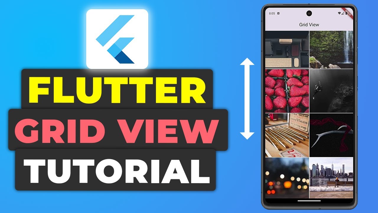
We use GridView.builder to efficiently create a scrollable grid. This builder is particularly useful for rendering a large number of items without significant performance issues. The images are fetched from Picsum Photos to ensure variety in our grid.
Widget _buildUI() {
  return SafeArea(
    child: SizedBox.expand(
      child: GridView.builder(
        scrollDirection: Axis.horizontal,
        gridDelegate: const SliverGridDelegateWithFixedCrossAxisCount(
          crossAxisCount: 4,
          crossAxisSpacing: 4,
          mainAxisSpacing: 4,
          childAspectRatio: 1,
        ),
        itemCount: 50,
        itemBuilder: (context, index) {
          return Container(
            decoration: BoxDecoration(
              image: DecorationImage(
                fit: BoxFit.fill,
                image: NetworkImage(
                  "https://picsum.photos/seed/$index/200",
                ),
              ),
            ),
          );
        },
      ),
    ),
  );
}
Customizing the Grid
In our GridView.builder:
- crossAxisCount: Specifies the number of columns in the grid, creating a visually appealing layout.
- crossAxisSpacing and mainAxisSpacing: Define the space between the grid items, ensuring a clean and organized look.
- childAspectRatio: Controls the aspect ratio of each grid item.
Loading Images
Each grid item is a Container that uses DecorationImage to display images from the internet. The NetworkImage widget fetches images from Picsum Photos, using a unique URL for each image to ensure variety across the grid.
Running the App
With everything set up, run your app using flutter run in your terminal. You should see a dynamic, scrollable grid of images that you can easily customize to fit your needs. Experiment with different GridView parameters to see how they affect the layout and appearance.
Get Source Code for free:
Conclusion
In this tutorial, we successfully implemented a dynamic GridView in Flutter, demonstrating the framework’s ability to handle complex layouts with ease. This approach provides a solid foundation for any application that requires grid layouts, whether for displaying images, lists, or other content. Keep exploring Flutter’s widgets to unlock even more possibilities for your apps.
Happy Coding…!


Leave a Reply